


Builder Grade Kitchen Makeover: Transforming A Starter Home Kitchen
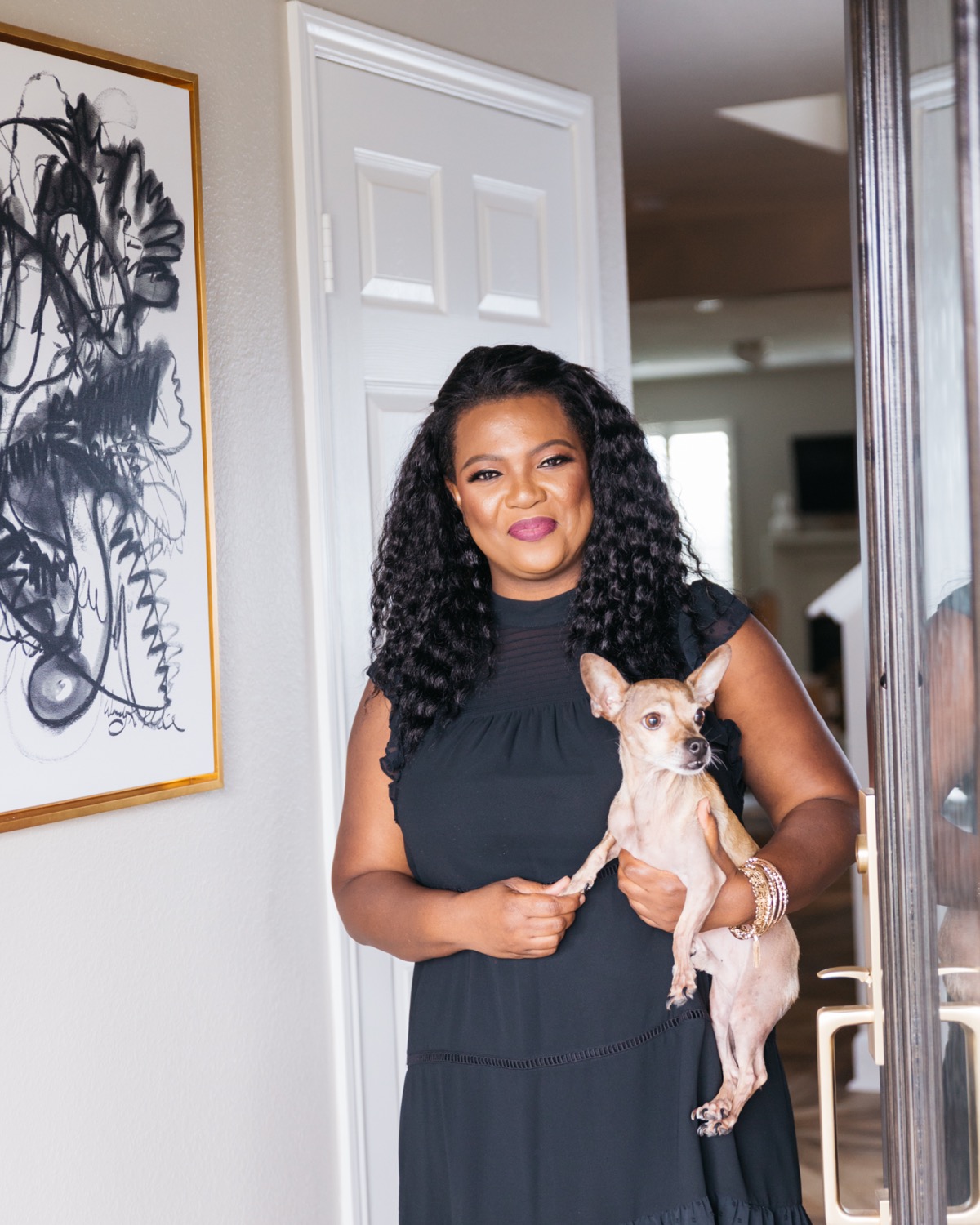
Looking back through my portfolio archives, one of my favorite personal projects from a few years ago was transforming the kitchen in my former home, a house I have since sold to my children.
When I originally moved into the property, it was brand new and completely builder basic, and I slowly turned it into a custom space tailored to the way our family actually lived.
Before tackling the kitchen, I had already completed the guest bathroom for the One Room Challenge. Next on the list was the heart of the home, starting with 3D renderings to map out every detail before construction began.

You’ve already seen my guest bathroom that I completed in May for the One Room Challenge.

Today, I want to share that before-and-after transformation and walk through the design decisions that turned a standard builder-grade layout into an unforgettable custom kitchen that my kids still get to enjoy every day.
When I originally chose the floor plan from the builder, this one stood out because of its generous kitchen footprint.
Even though I am not an avid cook, I love a spacious kitchen with plenty of storage and prep room.
Here is a glimpse of what the space looked like originally before we touched a single cabinet.
And here are some photos right when we started construction.


As you can see, it was not a terrible kitchen, just far too vanilla for my taste.
To keep the budget smart, I kept the exact same footprint. Having the sink under the window rather than in the island took some getting used to since the island sits closer to the refrigerator and cooktop, yet keeping the island uninterrupted gave us a huge expanse of usable counter space.
Comparing our initial 3D renderings to the finished room shows how helpful visualization is before starting a remodel.
A few details evolved once we priced everything out, which is the exact purpose of planning in 3D upfront.


During the initial build, I intentionally selected the builder's most basic finishes knowing I planned to overhaul them.
Rather than tearing out brand-new cabinet boxes, we kept the existing structure and completely customized the fronts. While my original renderings envisioned brand-new custom cabinetry from scratch, pricing out a full tear-out made modifying the existing boxes a much smarter investment.
We trimmed out the sides of the upper cabinets and replaced the doors with glass-front inserts. Down below, we converted almost every lower cabinet into deep drawers, keeping standard doors only beneath the sink since drawers are far easier to use every day.
We also replaced the over-the-range microwave with a custom vent hood and upgraded the pantry door with a custom herringbone wood facade.
Here are some progress shots.


My goal was a collected "unkitchen" feel rather than something overly slick or sterile. I wanted the finishes to feel handmade, layered, and comfortable.
I also had to be realistic about neighborhood comps, since the house sat in a starter-home subdivision where over-improving is easy to do. I knowingly invested more into the renovation than I would immediately recoup on the open market because I wanted to love living there for years to come, and knowing it eventually stayed in the family made every custom detail even sweeter. Still, balancing personal joy with resale value is always something homeowners should weigh carefully.
Just like the living spaces I design for clients across Katy, West Houston, and Northern Arizona, I wanted this kitchen to feel curated yet cohesive by mixing patterns and textures intentionally.
Notice how I extended the backsplash tile all the way above the windows and down to the floor past the end of the cabinetry. Taking the tile to the floor created a far cleaner architectural line than stopping it awkwardly beneath the upper cabinets.
At the same time, near the pantry door, I intentionally stopped the backsplash flush with the cabinetry rather than wrapping it onto the perpendicular side wall. Knowing exactly where to terminate tile is a small detail that makes a huge difference in how polished a kitchen looks, and it is why calling in a professional to help with the design of your kitchen pays off.

For color, we painted the upper cabinets a deep charcoal gray and brought in a decorative artist, Faux by Jenny, to apply a subtle faux finish, painting the cabinet interiors crisp white for contrast.
The lower drawers were finished in creamy white with a rich dark stain peeking between the drawer fronts, while the island was wrapped in trim and painted a saturated deep teal.
For the pantry door, we stained pine wood in a deep tone and wiped it back for a weathered, rustic patina, painting the interior of the pantry teal to echo the island.
People often ask why I chose glass fronts for every single upper cabinet. While open display is not for everyone, I have a large collection of white pottery and dishes I wanted to see and enjoy daily rather than hiding them behind solid doors.

I also upgraded the appliances one tier above builder standard. Since I am not a gourmet chef, I did not need commercial-grade equipment, just cleaner lines and better functionality, with a black stainless refrigerator serving as my main appliance splurge.

Hardware played a huge role in making the cabinetry read like fine furniture. Combining brass campaign pulls with sleek linear handles gave the drawers a tailored, collected character.

For the backsplash, I chose an 8-inch hexagon cement tile with delicate gray geometric lines that create movement without feeling busy.
We paired that with durable porcelain countertops featuring a dramatic 2.5-inch mitered edge and a waterfall side panel on the parameter cabinets as a slight nod to the waterfall trend, without going overboard.
Every home should reflect the personality of the people who live there rather than following passing trends, and the whimsical pendant lights over the island captured my style to a tee.

Even my vintage ceramic pig found his rightful home on the counter as our official kitchen mascot after years in storage.
Underfoot, we installed 30x30 porcelain parquet-style wood-look tiles throughout the entire first floor. The pattern reminded me of a classic Parisian apartment, making it a splurge I never regretted.

The custom Roman shade above the sink remains one of my favorite details. That linen fabric with whimsical antelopes brings an instant smile the moment you walk into the kitchen.

Pairing a deep undermount sink with a warm brass faucet added both everyday practicality and vintage charm.

Finally, hair-on-hide barstools tucked under the island gave my family our favorite spot to gather, eat, and catch up at the end of the day, including my son Joshua, my daughter Courtney, and our chiweenie Rufus.


Looking back, it was definitely not your standard builder-grade kitchen, and seeing my children make memories in it today makes all that planning worthwhile.
This kitchen was featured in an overall HGTV Magazine spread, as well as in Apartment Therapy
Be sure to check out our Kitchen and Bath service options if you are ready to transform your own space.

Wishing You Boldness & Great Style!


Comments