


9 Best Benjamin Moore Warm Gray Paint Colors That Will Never Be Outdated
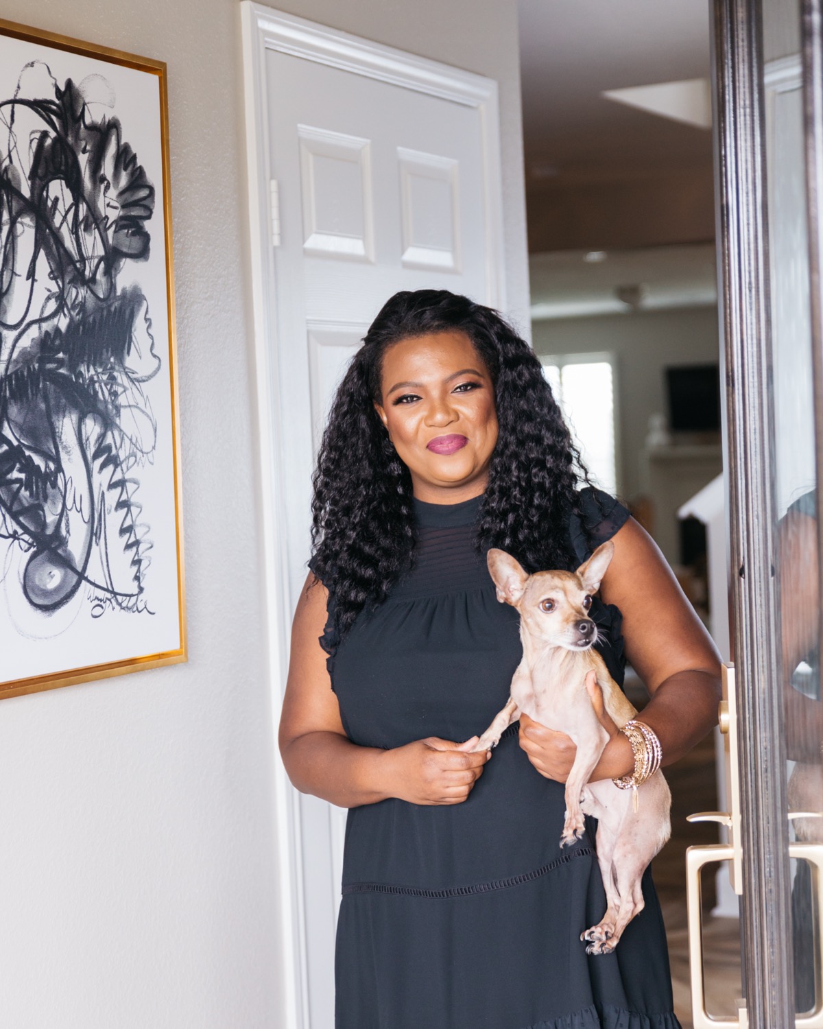
The color gray has held its position in the world of design for a very long time. But recently, we have seen designers moving away from grays in favor of warmer neutrals.
But if you are familiar with the term "greige", then you will already know that there are some wonderful warm grays that were also very popular a few years ago. Greige simply is a color that has gray and beige.
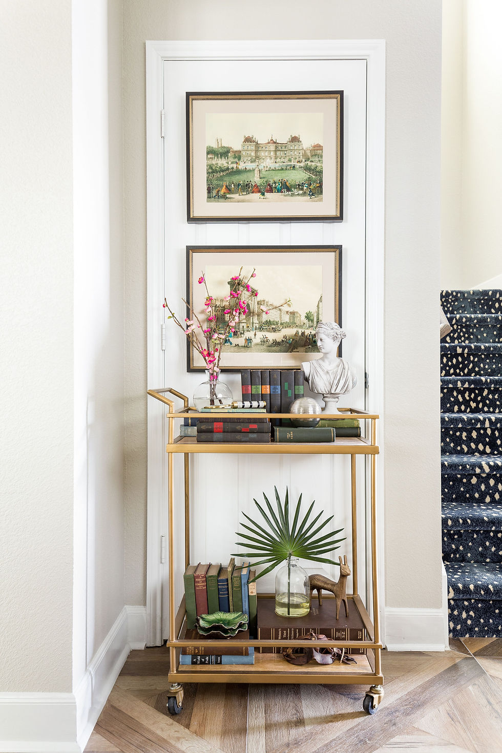
The moving away from grays isn't so much that gray is a bad color. I don't think there is such a thing as a bad color if it is used in the right way. The problem was the overuse of it.
Interiors became gray on gray central instead of people expressing their style and personality in their homes.
Gray will forever be a mainstay for designers like me.
It was very rare that I even used cooler grays anyway. They were often a bit too cold and modern for the work I do. I was always in favor of the warmer grays, which often had a wonderful neutral back drop to a design scheme.
Over the years, I developed a list of my favorite warm grays and this post will showcase nine of the lighter shades of greige that I love and I personally think will never be outdated.
Before I get to the paint colors, please keep in mind that color is affected by light, so they may appear different in your home. We always recommend trying samples painted on walls or on poster board in your home first. Observe the colors at different times of the day.
I would also strongly recommend that you invest in some of Benjamin Moore's color fan decks before selecting your color. The fan decks are helpful in that they are arranged in some cases by how colors relate to each other, or arranged in collections of color.
The Affinity Collection by Benjamin Moore includes colors that work very well with each other.

Here are a few other fan deck of color collections.
Ok, let's get to it - The nine best Benjamin Moore Paint Colors That Will Never Be Outdated.
1 - Revere Pewter
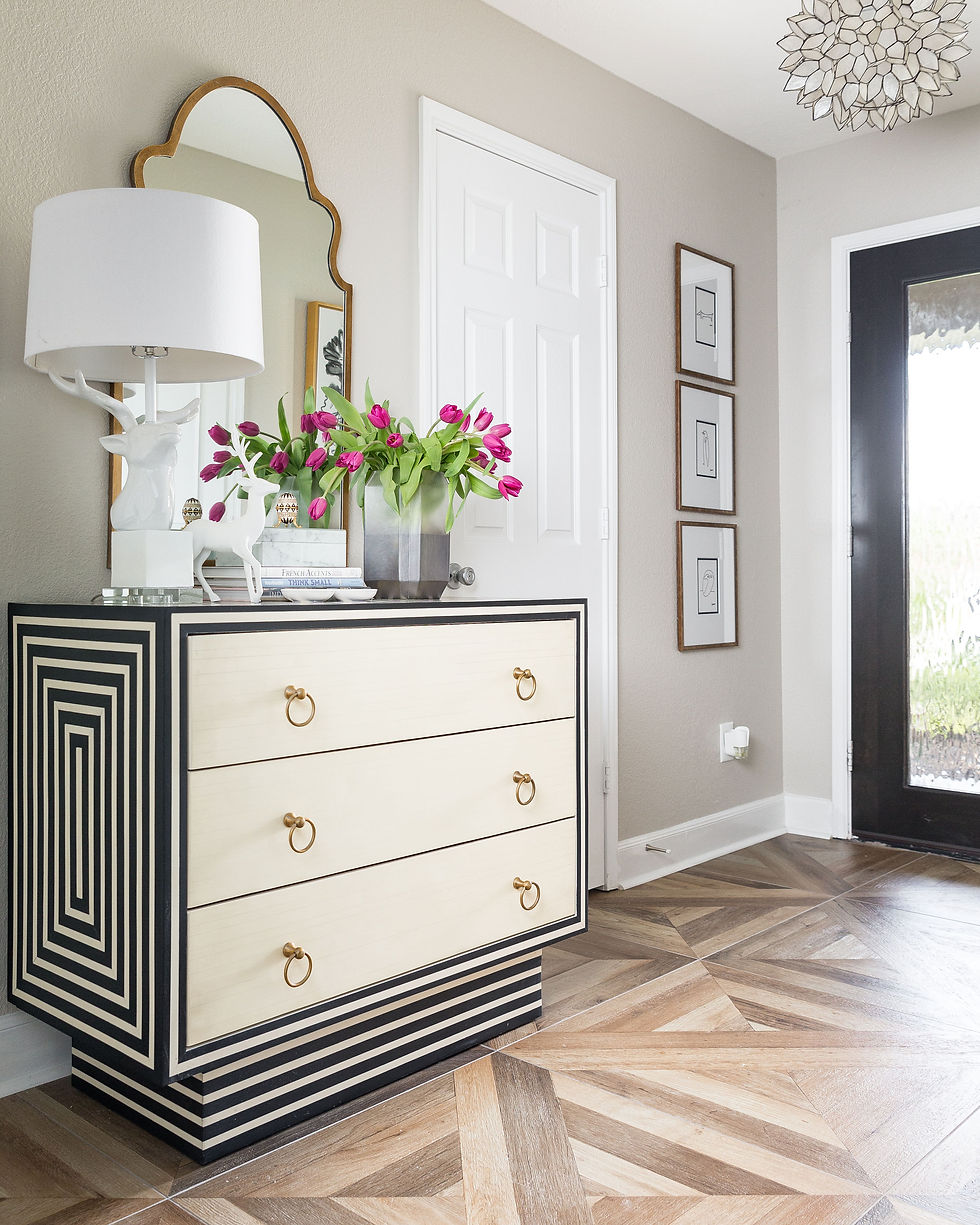
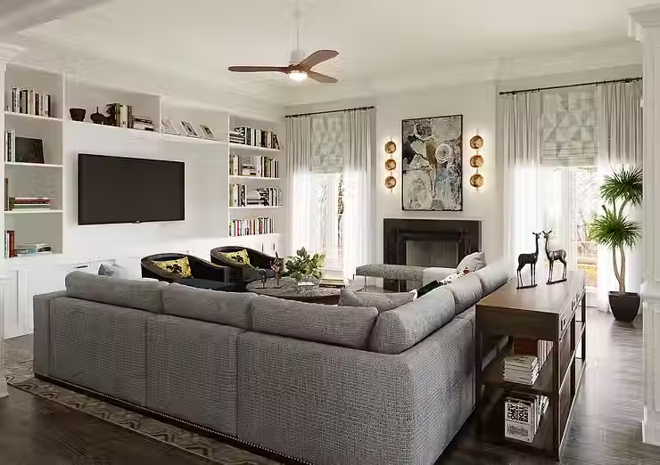
Benjamin Moore Revere Pewter is by far the most popular warm gray there is. I personally have used it many times. In fact, the photos above are of my home with Revere Pewter walls.
It is a very versatile color. I sometimes can see gray, beige, khaki and even blue in it depending on the time of day.
#2 Classic Gray

There is not a whole lot of wall space visible in this shot, but the tiny piece that you can see in this photo of my kitchen is Benjamin Moore Classic Gray in eggshell finish.
There is a lot of light coming in from the window across the room, so Classic Gray is slightly darker than what you are seeing here.
Classic Gray is one of my go-to warm grays
3 - Gray Owl

Benjamin Moore Gray Owl can actually read as a cool gray as well as a warm gray. It's a color that I have used quite a bit because it is pretty versatile. It works very well in bedroom spaces because it feels nice and serene. I think it is the hint of green in it.
4 - Silver Satin

Benjamin Moore Silver Satin is another one of those colors that can feel like a cool neutral as well as a warm.
Here we used it in this living room that gets tons of natural light with its tall windows and soaring ceiling. But if you look carefully off to the right in that hallway that doesn't get as much light, you can see a truer view of the color

This is a closer look at the same hallway
5 - Balboa Mist
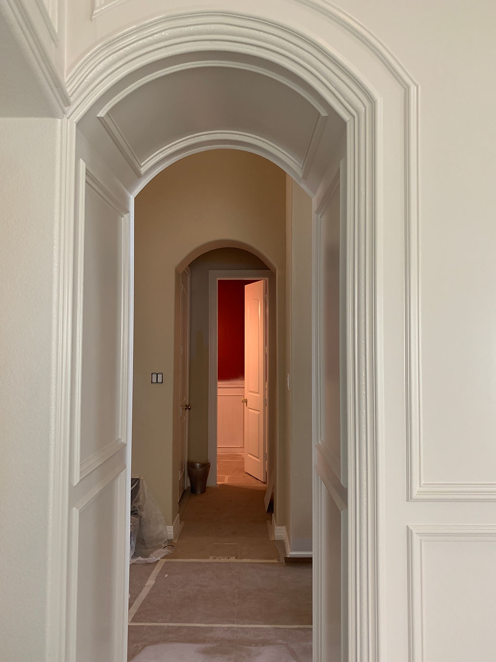
The above image is on of our projects in progress. We painted the newly installed millwork in Benjamin Moore Balboa Mist in satin finish.
In some photos of this same room, the color seems a bit darker. But this image shows a truer version of the color.
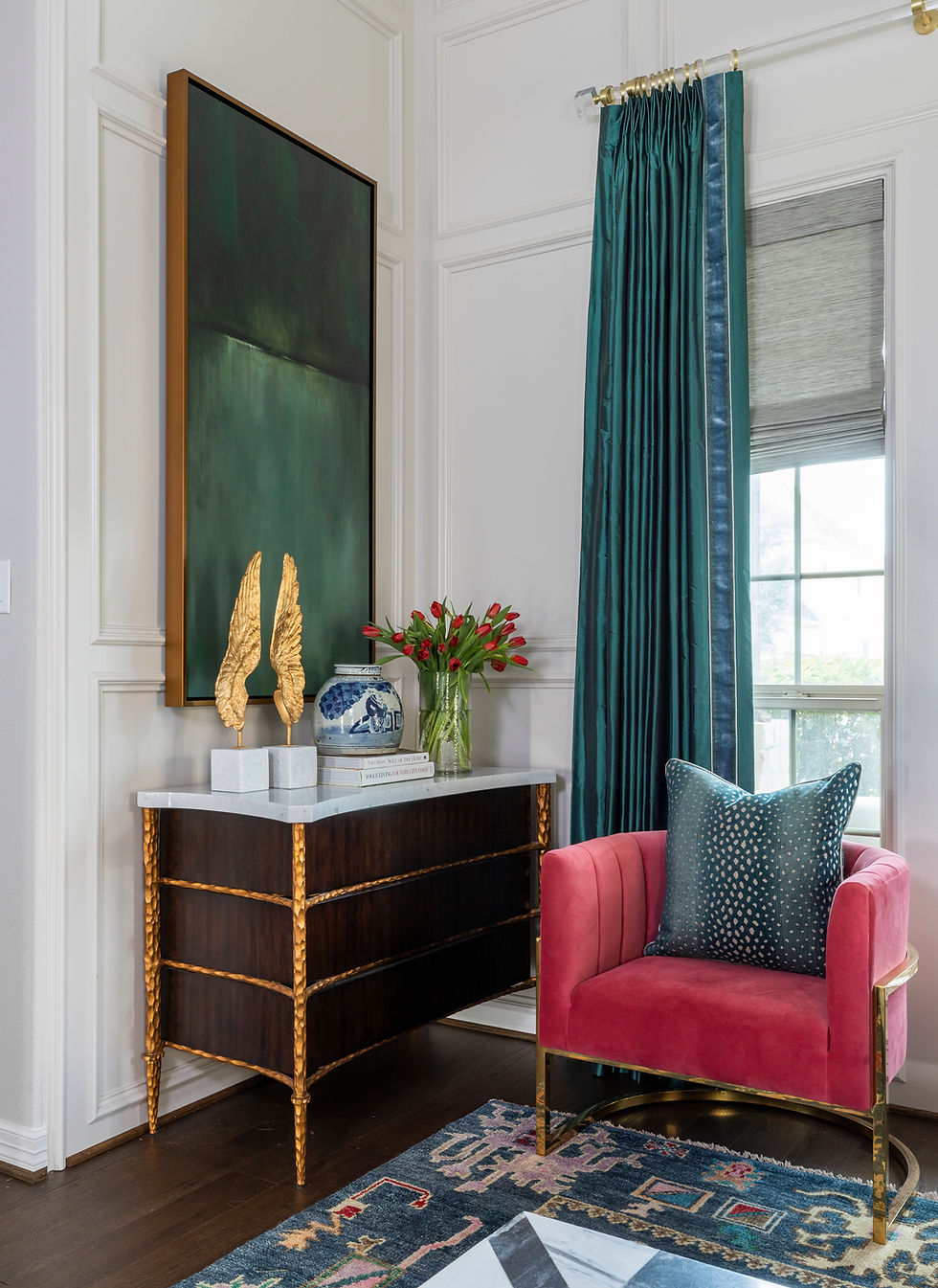
Here's another project where we used Balboa Mist
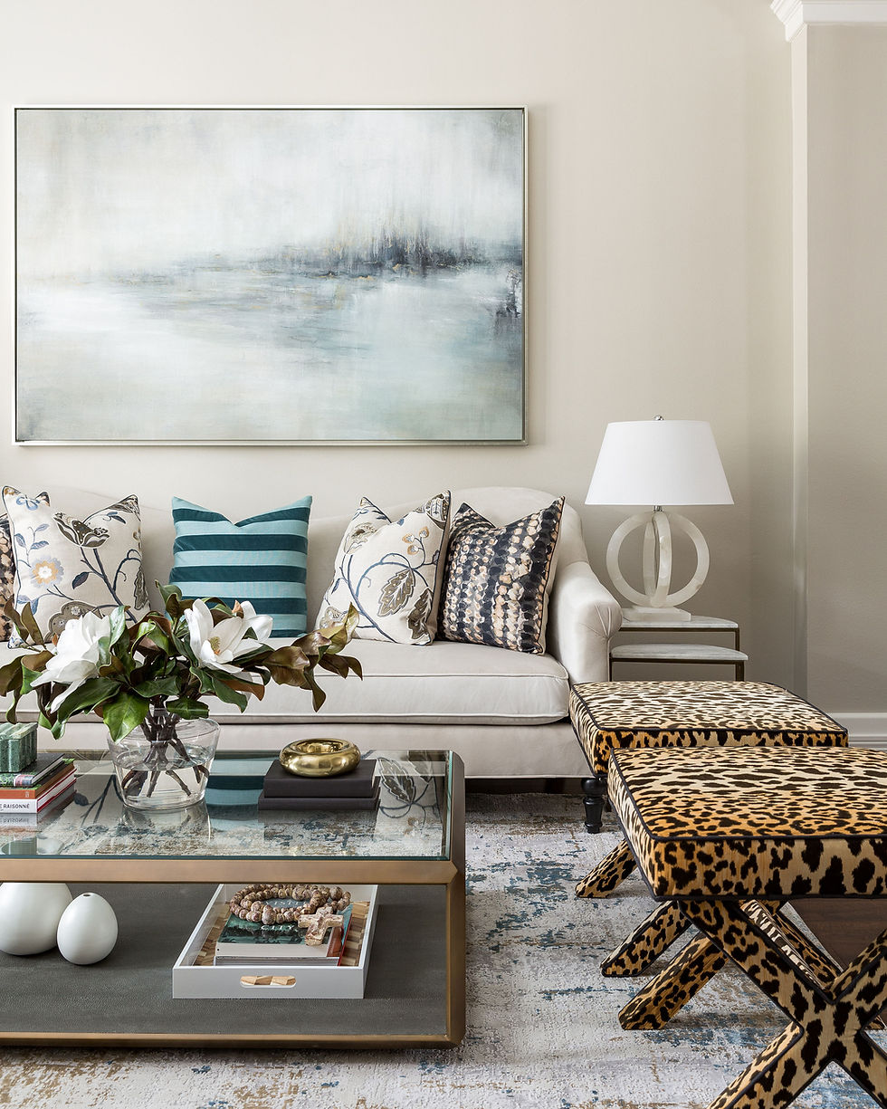
6 - Collingwood

I recently specified Benjamin Moore Wish for a lower level of a home we are working on, and quickly had to pivot to Collingwood after the first wall was painted. The Wish turned out to have a bit of purple in it - at least to my eye, and in the lighting of the space.
Collingwood is a very beautiful, warm gray that worked perfectly for what we were trying to accomplish. I have specified quite a bit when I flipped homes with a realtor I was partnering with, but I never stuck around for photos of those spaces.
The above hallway was painted in Collingwood in an eggshell finish
7 - La Paloma Gray
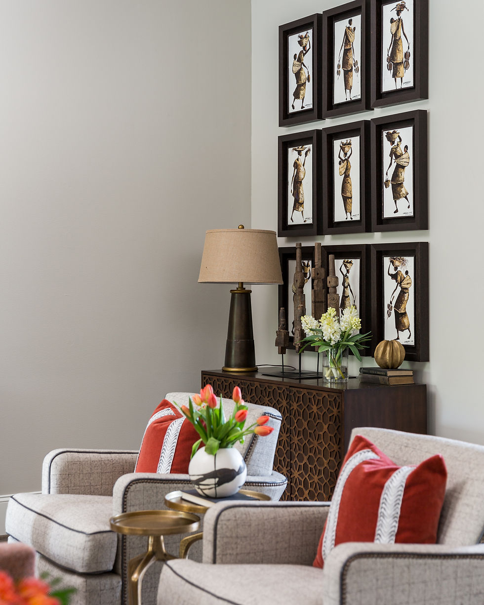
If you are looking for a more mid-tone warm gray, then La Paloma Gray is a great option. It does have a hint of khaki or green, but you can see from the image above that it is a great neutral back drop that doesn't dominate the color palette
8 - Edgecomb Gray
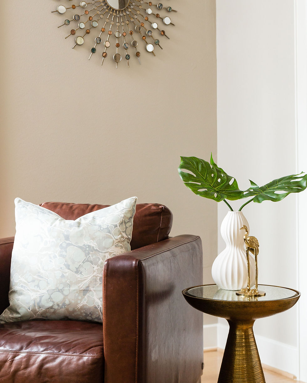
Edgecomb Gray in this image is not quite true to the color. In fact, you will notice that the two walls look completely different, when they are the same color. So test before committing to this.
Edgecomb Gray is one of the more popular Benjamin Moore colors, so it seems to work for a lot of people
9 - Himalayan Trek
This one is one of the lesser known colors, but it is a rich and warm gray that has quite a bit of brown in it.
This one can get pretty tricky, so be sure to test it first.
Pin to Pinterest for easy reference.

Check out some of my color palette downloads for inspiring color palettes, including some neutrals. Click HERE
And these fabulous coordinating pillows by Arianna Belle (her shop soon to close permanently. See more pillows HERE
Emperor's Garden Grey | Kubus Argent | Leopard Linen Taupe and Ivory | Latte Velvet | Poetical Grey | Channels Taupe
Lots of other pillow inspirations in gray colorway.
Need help with selecting the right color for your home. Schedule a consultation
Wishing You Boldness & Great Style!
Veronica
This post contains affiliate links. If a purchase is made using these links, we receive a small commission at no additional cost to you.


Comments